Wednesday, November 27, 2013

Tools for social network analysis from beginners to advanced levels

This year I've been drawn to the power of social network analysis. Monday I'll be taking my exam of the Coursera MOOC about SNA. Even though this is quite a scientific course, you learn new ways of looking at networks and for instance using Gephi with all its possibilities. Tomorrow I have a webinar with a group of people interested in social network analysis, interested in the tools. What I'm doing in this blogpost is classifying some tools for network from EASY through INTERMEDIATE to DIFFICULT.

It's good to distinguish between EGOnetwork analysis and whole network analysis. An EGOnetwork analysis is mapping the network of relationships of one person (usually your own network!).  In Network analysis you identify a network, a friends network, a LinkedIn group or a community of practice, or in the course a dolphins network. There are some simple tools which can help you map your own social media network.
niveau1
LEVEL 1 EASY
Tools in level 1 are the Egonetwork tools which are available on the web and which make it possible to analyse your network in one click. You may do this in 1-2 hours.
  • With one click you can map your LinkedIn network (except if your network is too small or too large. It automatically colours the subnetworks. It is a good exercise to name these subnetworks. What kind of people would you like to have in your network.
facebook netwerk nov 2013facebook netwerk touchgraph nov 2013


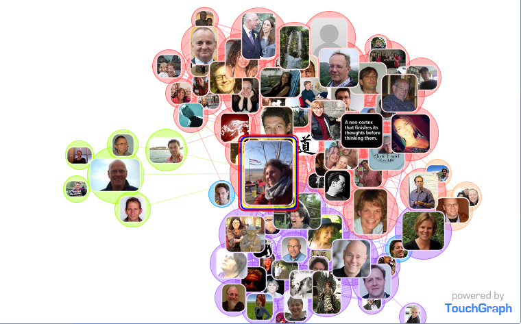
  •   You can do an Egonetwork analysis of your  Facebook network met Touchgraph - see pictures above. Just like with LinkedIn maps you can see subcommunities with different colours. Mijn main networks are my old IICD network and KM4dev/CPsquare networks. My friends network is the tiny part in green. That explains why I'm not that active on Facebook. You can actually do a lot of things with touchgraph, more than with linkedIn maps, like you can zoom in on your most important network, choose to show picture or names etc. See the examples above.  

niveau2LEVEL 2 INTERMEDIATE
Level 2 are tools that take more time to understand and work with. You may need a day or so, even though it is possible to learn it with tutorials from the web, or ask someone who knows the tools. Niveau 2 zijn tools die je wel even onder de knie moet krijgen. Nevertheless the tools are free: Gephi and NodeXL are both free and open source.. NodeXL is for windows and works with Excel.


  • You can download your Facebook network with Getnet  http://snacourse.com/getnetand then import it in Gephi. The difference with touchgraph is that you can do more analysis for instance look at the most influential people in your network.  

  • twitter netwerk toekomstglban interesting way of doing Network analysis of social media is with NodeXL you can import for instance Twitter Hashtag tweets, or a network of a twitter account (@joitske). I haven't tried a lot yet with NodeXL, I have been struggling a bit with the labels. Importing at times takes long because Twitter only allow a certain amount of data to be downloaded, so be prepared to set it up and let it run for a couple of hours. 

niveau3
LEVEL 3 DIFFICULT
The highest level of difficulty is doing a whole Network analysis with tools like Netdraw and Gephi. It is important to understand network measures like centrality measures and sub communities. It takes investment in knowing network theory and software.
  • Network analysis with Gephi. The SNA course used Gephi and I find it impression what you can calculate and analyse like average shortest path, modularities etc. I think it takes a good comparison with other networks to interprete these kind of overall network characteristics. See below a  Gephi example. Screen shot 2013-11-26 losmakers gephi
  • Similar to Gephi you can do Network analysis with Netdraw. So far I am very impressed with what you can do in Netdraw, especially the way you can visualize parts of the network and zoom in. For instance, if you have a network with agriculturalists, policy makers and advisors, you can plot the network of the advisors separately if you like. We did that for a large network zooming in on the provinces which was very useful to have a view of the network at provincial level. 

Tuesday, November 19, 2013

Design of blended learning: inspiration from a book about design thinking

I read the Dutch boek De Ontwerpfactor, written by Marguerithe de Man. She did a sabatical studying urban planning and landscape architecture which inspired her to write this book about design of learning and change trajectories. Marguerithe is part of our trajectory leren en veranderen met sociale media which makes it extra nice to read.
...ontwerpfactor What I liked most about the book is that it provides the space to look at the design process in different ways. In our own book we have four design stages for designing a blended program. After reading this book, I think we could have make more room for the individuality and personal style of trainers and consultants in the design process. It also helps me understand that at the end of the day about blended learning design most participants were not yet ready to really put a design on paper (or ipad). The actual design process is quite messy and needs time to ponder and mull things over. A beautiful sentence from the book: "The challenge is to discover your own design issues and process. There is not a single design process.." I remember we did a design session with roughly 10 people before our learning trajectory in which we wrote down the main issues to deal with. At the end we hardly looked at this list when designing the trajectory....

I read the book with the design of blended or online learning trajectories in mind. Some things I definitely take away from the book for the design of blended learning programs:
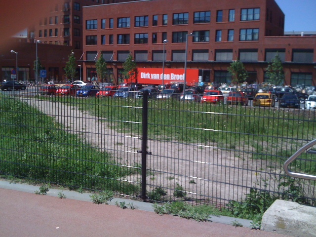
  • The metaphor of concrete and timber trees. What part of your design is crucial and need to be concrete and what aspects can you leave more open-ended? For a blended program: can the participants help shape and detail the goals of the trajectory? Is the platform a private online platform or is er openess to use online side-walks using other media? I think as a designer you have the choice to put everything in concrete but you can also design for flexibility. A nice example in our own district: people created all kinds of new paths because the route to the mall was not logical for walkers and cyclists. Are you going to build a fence (see picture) or customize your design? hek
  • The agent design (is this the right translation for middelontwerp?). For me this is a new concept, it prescribes how to manufacture the product. In a blended program you have no prescription but it may be necessary to clarify a number of assumptions - how independent you expect people to be... how much you're going to help if they get stuck. You can do this in an intake interview. For instance we are now more explicit during our intake that we are available for support when people are stuck in their cases but it is their own responsibility to call upon us. It can also include instructions for online platform construction if that is outsourced. It's new for me! Will need to think more. 
  • Working with personas. This is something I recognized from my own experience-it is very powerful to work with personas - when youare designing. I did this in a project with a design team. When working with personas you create an image of a user that you give a name. It is not a person but a number of people in the 'meat grinder' (as the book calls it). In our project it worked very well because every time we had new ideas we thought how Marjan and Kees would like it. When designing a blended program working with personas is a very strong approach because you can choose personas with different preferences and skills in working online. Why I have not used more often? - Perhaps because it is still a step that extra time seems to cost?
  • Design/ atmosphere. How important is the attractiveness/atmosphere? This is also something we can learn from designers - attraction is also important. I often tend to work with the tools out there, such as Sharepoint, or LinkedIn because I love working with the well-known tools, which is also an important consideration. However, I struggle with the attractiveness/atmosphere. After reading the book, I feel design considerations (attractiveness) is a little higher on my list of criteria in choosing tools for blended learning. 
  • Interface. Architects also work with the spaces between buildings - the interface. In blended trajectories you will have to switch between online and face-to-face. You will also have to space activities. Are you for instance planning weeks to rest with no activities? This is another example where I learned to be more explicit about our design. The first trajectory people complained that little was happening during the 'off-weeks'. 
Sorry, the book in only available in Dutch!